BED’S
The real rest
Bed’s’ dream was born in 1985 with the aim of offering specialised rest products through the sale of major mattress brands and advising its customers to ensure the best night’s sleep. Over more than 30 years, the brand has grown nationwide, offering more and more options for all kinds of needs.
After a 2020 full of uncertainty, as a result of COVID-19, which has led to a paradigm shift in distribution, Bed’s is committed to strengthening its value proposition and this requires a strategic reflection on the brand.
At Summa, we have taken on the challenge of promoting the Bed’s brand and reinforcing it as the benchmark brand in the specialised bedding sector, contributing from the brand to make the company’s business objectives a reality. For this it was necessary to focus on a previous and deep diagnosis of the brand, in order to redefine what the brand means and how it is expressed in all points of contact.
The interaction with internal and external stakeholders was fundamental to lay the foundations for the development of a renewed brand experience, an attractive identity that would better connect with its audiences through activation and communication at all brand touch points (physical stores, e-commerce, etc.).
Do you know how to rest?
lk about Bed’s, and this is the visual concept that is transmitted through a new identity that radiates tranquillity, comfort and well-being in a soft, light, warm and close way for the target.
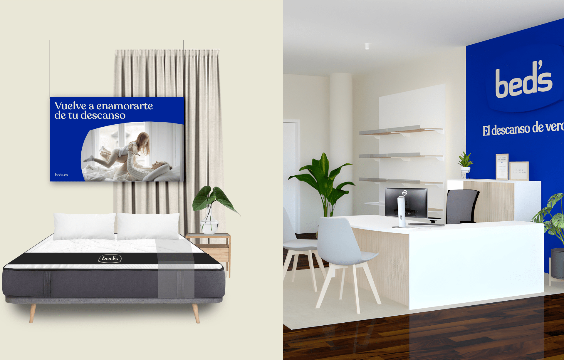
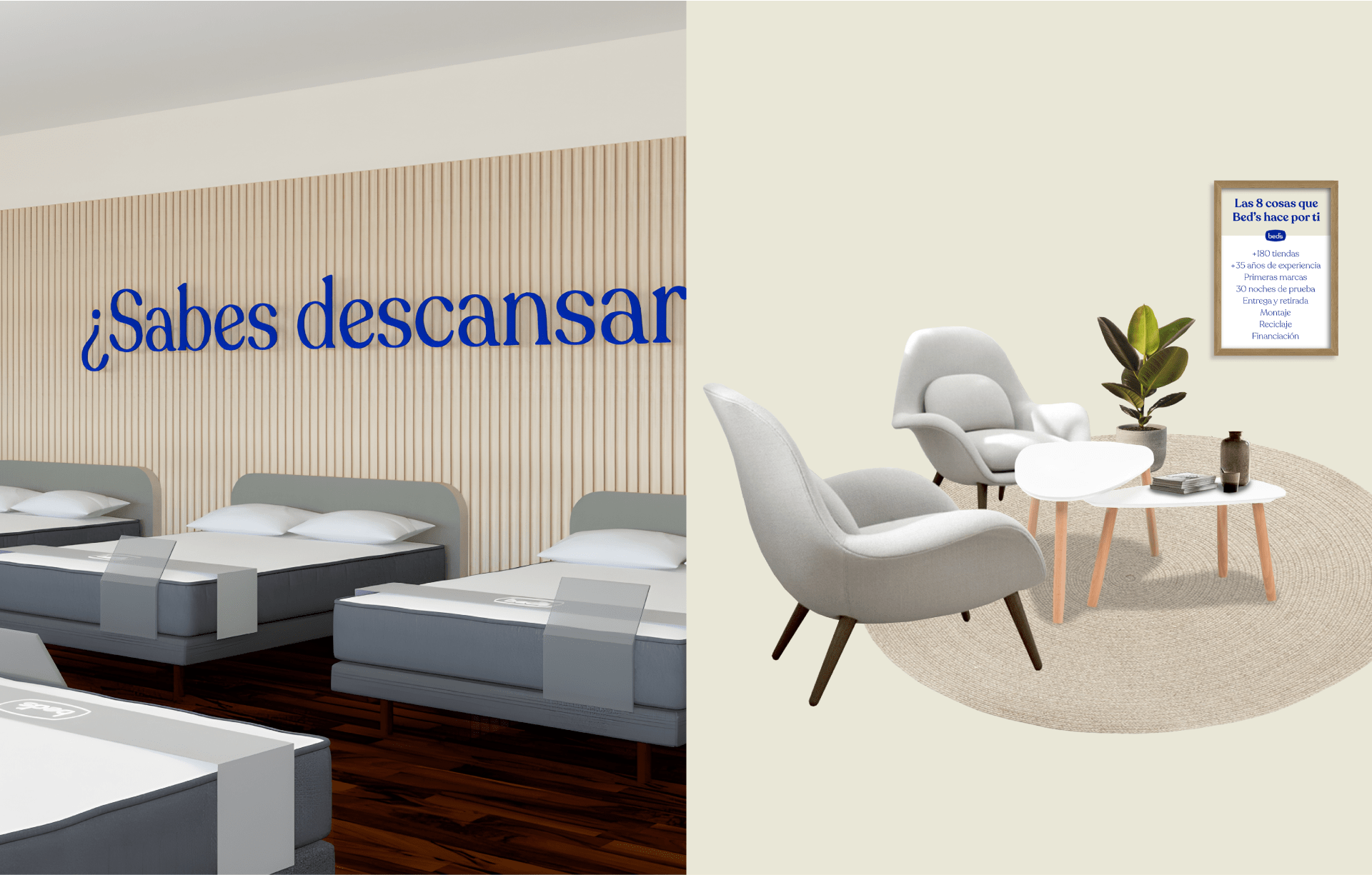
Bed’s stores have to transmit the same sensations as the brand. Therefore, the characteristics that define the brand have been transferred to the physical space: warm, natural, cosy, soft and comfortable decoration and materials.
Bed's new-look rest
The visual change that Summa developed for the brans new rest involves a tonal and colour change of the current logo. The blue and white, Bed’s main shades, evolve to a darker blue, which positions the brand as a leader in the sector, and a beige that conveys a cosier and more homely feeling.
This change of colour has also been applied to the logo, which also dispenses with the fillet in the main version. This simplifies and modernises the logo.
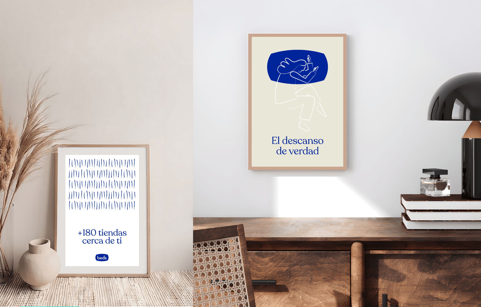
To define the complete visual system, a series of resources were created, such as a rustic manual stroke with which different abstract illustrations have been created, representing the shapes that deform mattresses, and others representing people resting in different ways.
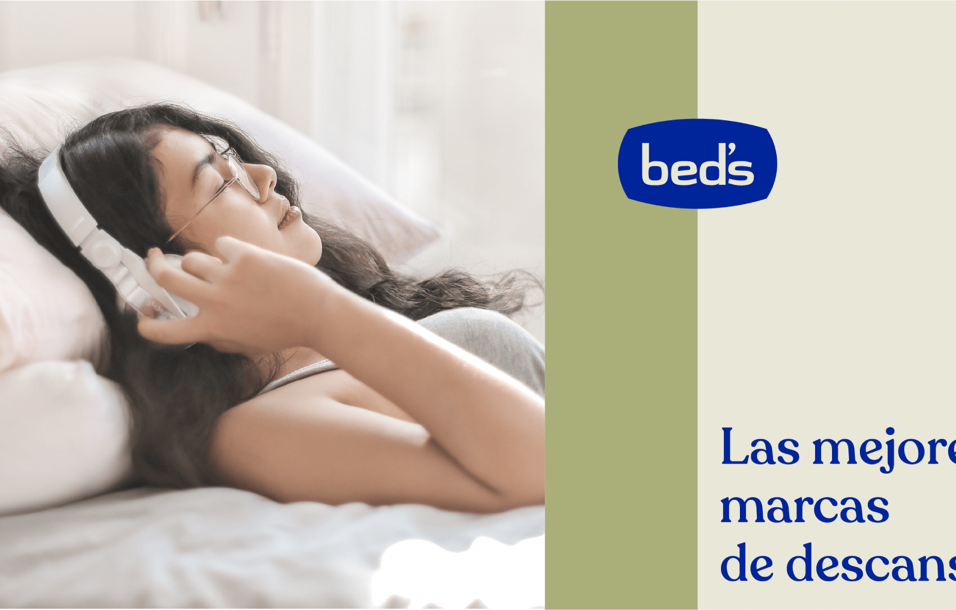
In addition, all these illustrations combine the logo tablet, which Summa has freed from the logo, to coexist with the rest of the elements, creating windows for photographs and all kinds of compositions that serve to create both corporate and communication pieces.
A strip-based composition system has been defined for the communication elements. These are inspired by the different layers that make up a mattress.
This new graphic identity is transferred to the physical stores, which reinterprets the concept of “feeling at home”, but in a Bed’s store.
To achieve this, the brand’s concepts are adapted to physical materials typical of interior design, i.e., warm, natural, homely materials such as light wood, fabrics in carpets and curtains, plants and decorative paintings.


